Top 15 Google Fonts for Website Design 2024

Consider your website’s layout as a first impression and one that relies heavily on font selection. Your website will look good and be easy to read with a well-chosen typeface. Because of this, the typefaces you use on your website are critical to conveying the essence of your business and creating engaging and educational content.
Additionally, Google Fonts is the ideal source for fonts for websites. Several studies claim that there have been 50 trillion font views on Google Fonts.
Additionally, according to BuiltWith Trends, more than 50 million websites are currently active and more than 113 million websites use the Google Font API.
Interestingly, more than 36% of all websites worldwide use Google Fonts. More than 5.6 million of them are located in the United States.
These figures clearly show that Google Fonts is one of the most popular font services available worldwide. Given that Google Fonts is expected to grow 10% in usage and popularity annually, this trend is sure to continue.
Notably, Google Fonts provides a wide selection of fonts, including sans-serif, serif, monospace, and display fonts. While this makes it easy for site developers to choose typefaces that suit their needs, it can also make the process of choosing the best Google Fonts for your website intimidating, especially if you’re not a designer.
This section examines the art of choosing fonts for websites, including the top 12 Google fonts and recommended practices for striking the ideal balance between usability and aesthetics.
What Are Google Fonts and Why Choose Them?
Use Google Fonts, an open-source collection of over 1,300 font families, on your website for free. Since they have been operating since 2010 and are hosted by Google, they load consistently and quickly and are compatible with most devices and browsers.
Given the importance of accessibility in choosing fonts for websites, Google Fonts is a good option. Typefaces are primarily readable and web-safe.
Additionally, they improve readability and clarity, so users on different devices and browsers can see your information as intended, resulting in a better user experience.
Again, Google Fonts offers a surprising selection of typefaces. With over 1,300 font families available, you can choose a font that perfectly complements the design and content of your website. Because of this diversity’s ability to foster creative flexibility, it’s easy to highlight and develop a compelling online character.
Additionally, Google Fonts is an easy way to implement. Using standard HTML and CSS, you can easily add them to your website. Because of its simplicity, web developers have less work to do and the typeface loads faster, improving overall website performance.
15 Best Google Fonts for Websites
Let’s get started and find the ideal typeface for your online endeavors.
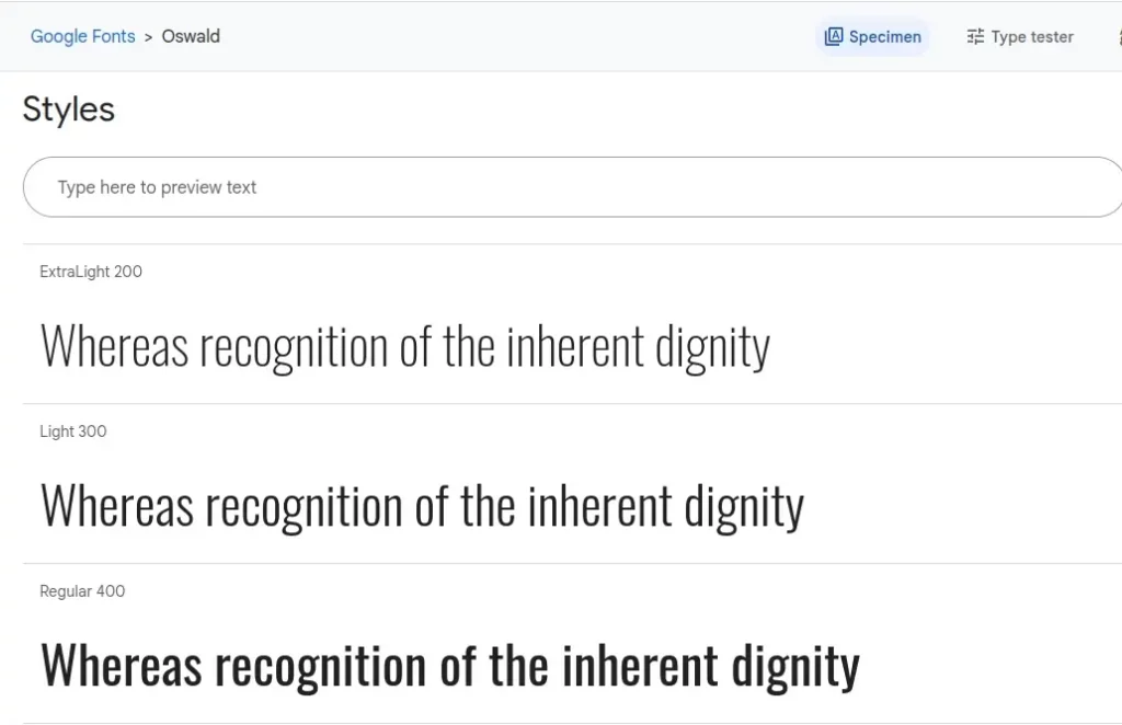
1) Oswald
Another bold and condensed sans serif font available from Google Fonts is called Oswald. Powerful business websites, tech businesses, and contemporary projects will all benefit from its strong geometric design, which gives it a sleek, futuristic look.
Oswald commands attention with his unique lines and short pauses, which convey a sense of urgency.
2) Merriweather
Google Fonts’ Merriweather is a traditional serif typeface known for its outstanding versatility. Merriweather’s traditional design and well-defined serifs make it easy on the eyes and improve comprehension of text-rich information, making it perfect for educational and research-based websites.
It’s a great option for academic writing, papers, and teaching platforms because it’s a reliable way to project professionalism and authority.

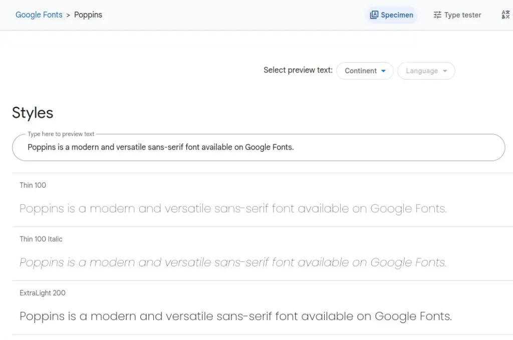
3) Poppins
Poppins is a contemporary sans-serif typeface that can be found on Google Fonts. Poppins is a great option for a variety of websites, especially for the business and e-commerce industries, due to its simple lines and geometric shapes.
It also gives your content a professional touch and is perfect for displaying information clearly due to its simplicity and readability.
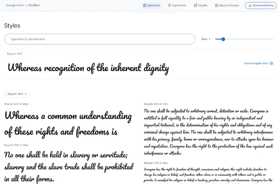
4) Pacifico
If you’re looking for a more comfortable Google font, Pacifico is a good choice. It’s ideal for personal blogs, creative portfolios, and websites that cater to a younger or more artistic audience due to its elegant and handwritten design.
Pacifico gives your content a warm, inviting feel, making it perfect for websites that want to be creative and cut to the chase.
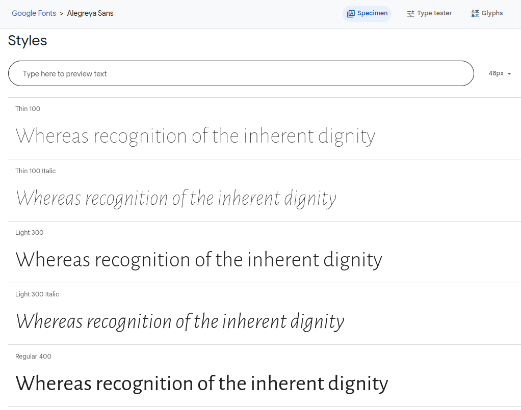
5) Alegreya
Alegreya is a sophisticated and durable serif font notable for readability and grace. It is a great option for websites about art and culture because of its timeless style and modern serif fonts.
Alegreya elevates your content, making it ideal for presenting history, literature, or any other topic that has a classic appeal.
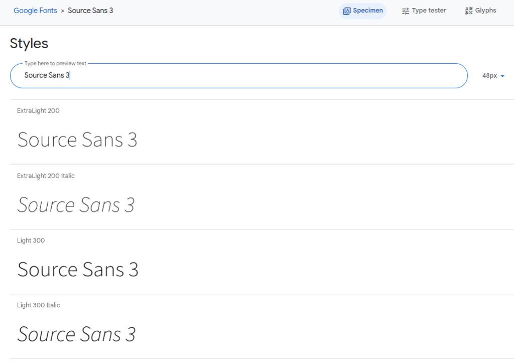
6) Source Sans 3
You don’t have to look far for flexible typefaces that you can use for almost anything. Source Sans 3 is intended to work effectively in most user interfaces and can be used for headings as well as body text.
This typeface is a fantastic option for websites that need a simple, easy-to-read typeface that works well with other typefaces.
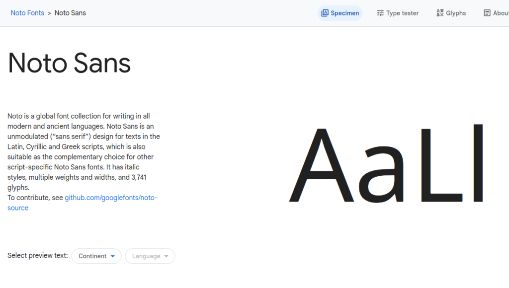
7) Noto Sans
Due to its wide range of language compatibility, Noto Sans is a good option for websites that need to serve multilingual and multicultural users. More than one hundred Latin languages are supported, and it comes in different weights.
Whether you manage a bilingual blog or an international company, Noto Sans ensures that your content is understandable and presented in a consistent, clear manner.
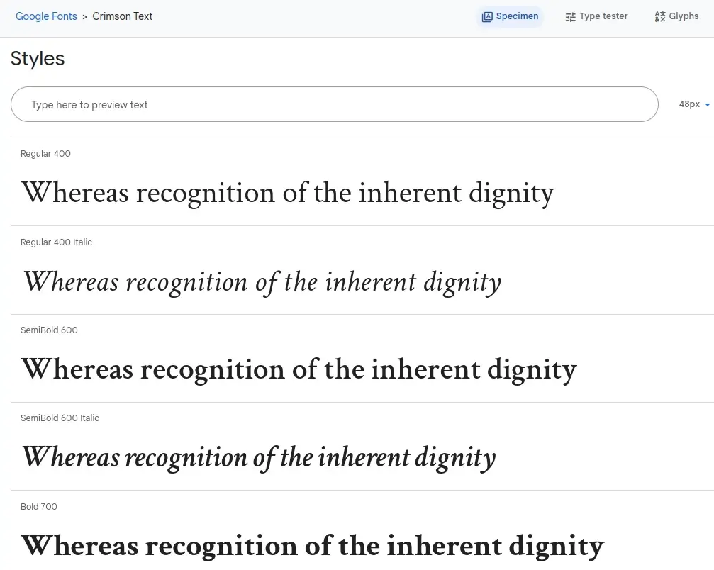
8) Crimson Text
Another classic serif typeface, Crimson Text, concludes our review. This font is notable for its traditional and ageless look. This works well for academic, literary, or historical websites.
It’s especially a great option for presenting research papers, scholarly articles, and any other topic that could benefit from a bit of scholarly flair and tradition.
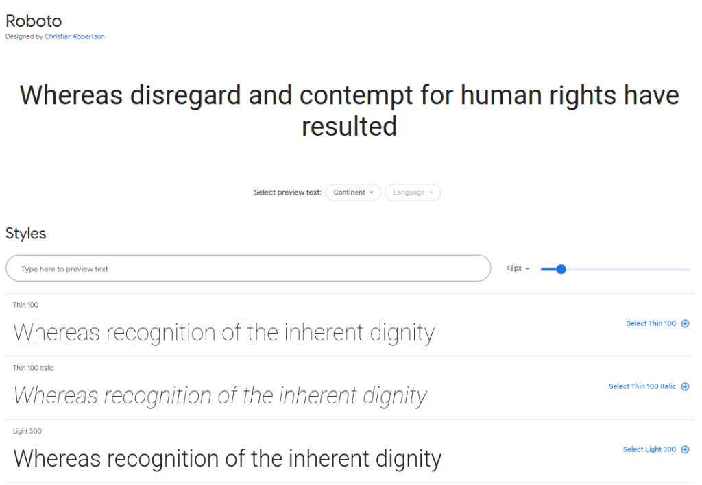
9) Roboto
Google Fonts offers Roboto, a popular sans-serif typeface that is incredibly adaptable. It’s a great option for many online applications because of its neutral style and clean, modern look. It is a great choice for both personal and business websites because of its readability and flexibility across different screen sizes and resolutions.
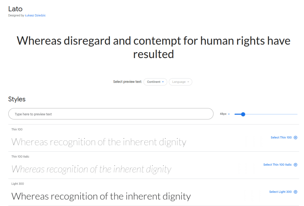
10) Lato
Lato is a friendly sans-serif font that can be found on Google Fonts. Lato’s friendly and approachable design makes it a great option for websites that want to project a friendly and inclusive vibe.
Because of Lato’s adaptability and readability, you can be sure that the content on your website is entertaining and communicates effectively, which will improve the user experience.
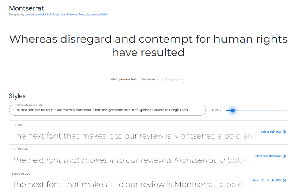
11) Montserrat
The next font we review is Montserret, a geometric sans-serif typeface that is bold and available on Google Fonts. With its sleek and contemporary style, it’s perfect for websites that focus on technology, fashion and design.
The charming line shapes and striking contrasts of Montserrat draw attention and give your writing a refined edge.
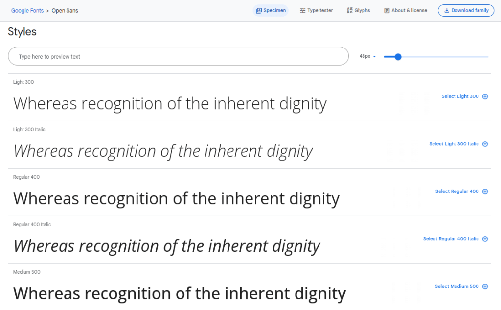
12) Open Sans
Popular for its uncomplicated and straightforward look, Open Sans is a great option for websites, especially those focused on news, magazines, or blogs. Open Sans is customizable and gives your content a clean, contemporary look while being approachable and accessible.
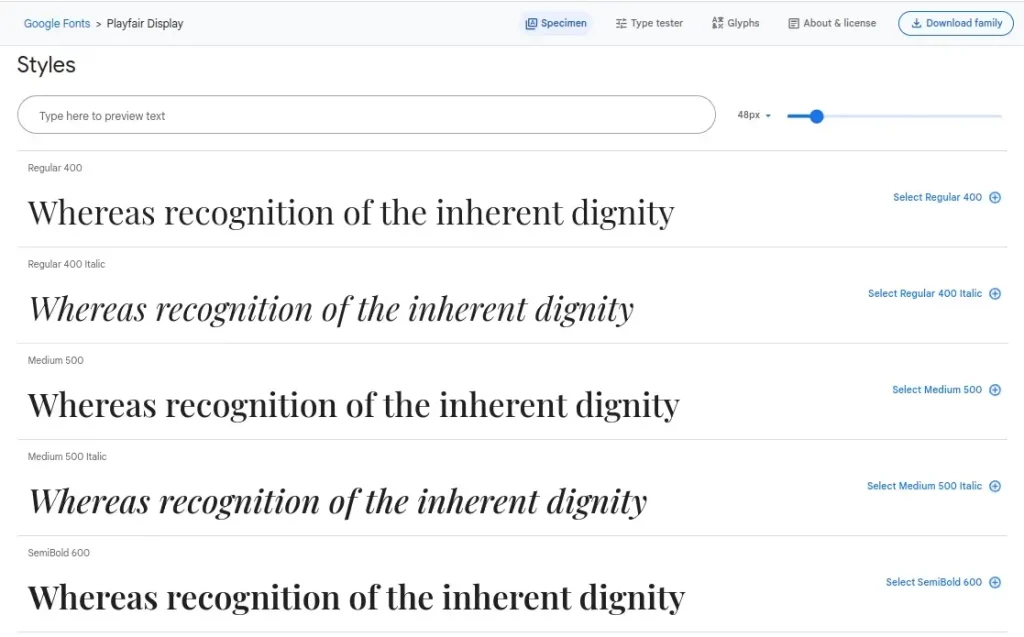
13) Playfair Display
Playfair Display is a sophisticated, elegant, high-contrast serif typeface ideal for high-end design-focused websites and fashion and luxury companies.
It is a great choice for websites that exude sophistication and class due to its unique serif and fashionable look. Playfair displays elevate any online presence, whether it’s for art or luxury goods on display.
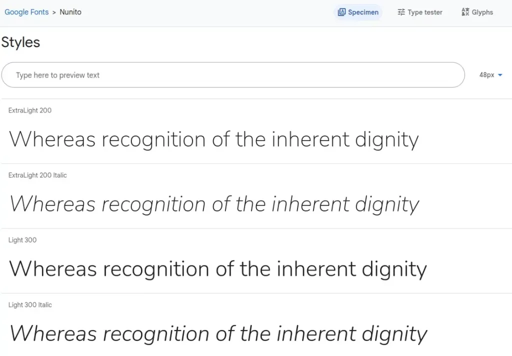
14) Nunito
Nunito, a rounded sans-serif font from Google Fonts, is renowned for being approachable and simple to read. This is a fantastic choice for websites that wish to appear approachable and kind.
Additionally, Nunito is suitable for a variety of content types, including blogs, online magazines, and educational websites, due to its balanced style and variety of fonts.
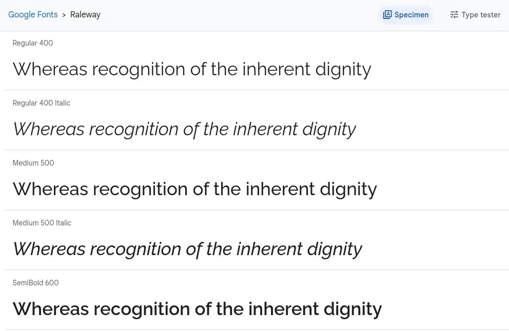
15) Raleway
Raleway is a great option if you’re looking for a sophisticated and fashionable sans-serif font. Its contemporary style makes it a great option for fashion blogs, design-focused websites, and creative portfolios.
Raleway is a great option for imaginative and design-focused websites due to its adaptability, simplicity, and elegant appearance.
Best Ways to Add Google Fonts to Your Website
Although Google Fonts is easy to use, you’ll be more productive if you follow these best practices.
1. Examine Your Brand Identity
Always keep your brand identity in mind when choosing fonts. Fonts have a big impact on brand awareness because they can evoke feelings and associations. Choose typefaces that are a seamless blend of your visual identity and the typography on your website, reflecting your business’s personality and messaging.
2. Classification Of Typography
Using different types of typefaces and font sizes to establish a distinct hierarchy within your content is known as a typographic hierarchy. To guide visitors around your website and highlight the most important information, headers, subheadings, and body text should all have a distinct visual identity. User experience and content organization are improved through clearly defined taxonomy.
3. Legibility And Readability
Prioritize legibility above all else when selecting fonts. Legibility is the uniqueness of each character in a document, whereas readability is the ease with which a text may be read. Select typefaces with clear letterforms and appropriate spacing. This will guarantee that your material remains comprehensible and easily accessible even after prolonged reading sessions.
4. Font Combinations
Font pairing involves choosing and mixing typefaces to create a cohesive and appealing design. Make sure the fonts you use for your body text and headings match each other. For a well-balanced and visually striking typographic layout, combine a decorative or display typeface with a straightforward, highly readable font.
5. Don’t Use Too Many Fonts
Use only the typefaces you absolutely need, and try to limit the amount of fonts used on your website. A design that is disorganized and uneven can result in unnecessary font variation. In general, you only need to use two or three fonts to look unified and professional. Limiting your font choices can simplify your design and guarantee a more cohesive user experience.
6. Test Fonts On Different Devices
To guarantee a consistent and aesthetically pleasing presentation, test your chosen typefaces across a range of platforms and web browsers. Cross-browser and cross-platform testing is important because different screens and devices may render fonts differently.
Check their performance and speed. Additionally, make sure your favorite font is compatible with mobile devices. This guarantees that your typefaces will look great and be readable for all users on any device or in any browser.
ALSO READ:
- Next Exam Tak
- Homeworkify AI
- All Call Forwarding Deactivate Codes
- How to Turn Off Flash Messages on Android
- Free Manga Sites to Read Manga Online
- Snapchat Planets
- Youtube Croxy Proxy
- AI Content Detection Tools
- SEO Backlink Checker Tools
Abstract
Choosing the right Google Fonts for your website is a deliberate choice that affects readability, user experience and brand identity. It’s more than just aesthetics. Follow recommended procedures to create a harmonious blend of design and functionality.
By following these tips, you can get the most out of Google Fonts and use their potential to create a visually appealing and easy-to-use website that leaves an impression on visitors.